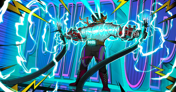
Have you noticed something about Hi-Fi Rush? Beyond it being a lot of colourful fun, that is. It’s to do with the look of it, those lines and dots you see applied to environments around you. It’s a bit like shading but oversized and deliberate, and layered on almost like a filter.
Hi-Fi Rush is not the first game to do it. XCOM: Chimera Squad did it a couple of years ago, and 3DS game Code Name: STEAM did it a few years before that. Superfuse, which comes out today (in early access), does it too. And if you cast the, um, web a little wider, you’ll see it in Spider-Man: Into the Spider-Verse – and what a wonderful film that was.
But why – why are they all doing it? Well, the obvious answer is that they want to look like an old-fashioned comic strip. That’s absolutely the case for Spider-Man and it’s probably not far from the thinking behind the games too.
There’s a lot to be said for it: it not only looks more interesting, just like you do as a K-pop star using an Instagram filter, but it has the double-benefit of being hardwired into our consciousnesses. When we see comics, it taps our nostalgia and whatever our memories of them are – maybe you read them, maybe you just like what grew out of them. Whatever it is, it probably signals to your brain good things.
I think you can feel this in a video by Bad Ink Studios on TikTok. It’s a video about an old comic shading process called Duo Shade, which is wild by the way – it involved applying a pair of solvents to paper to reveal darker lines underneath. Different solvent, different line. Use both and you get a darker shade. And the minute I saw it working in the video, I saw comics and got that emotional response.
Duo Shade, then, is clearly responsible for the lines part of the comic look.
But what about the dots? They are to do with halftone, which I’d been unwittingly seeing around me for years. Halftone is the process that uses many dots to shade an image. It was invented as a way for the commercial printing press to do pictures without having hard-carved blocks of wood, which were probably really annoying to use.
@badinkstudios #indiecomics #comics #howtomakecomics #manga ♬ Lo-Fi analog beat – Gloveity
The idea was simple: use dots close together to make darker areas or spread apart to make lighter areas, and at a distance, the human eye wouldn’t really see them, the dots, only a black and white shaded image. And then when colour came along, a similar technique was used to layer colours and dots to create endless variations of them. You can see pop art referencing this a lot.
But Duo Shade and halftone weren’t created intentionally as aesthetics. The inventors of them didn’t know pop art would immortalise them, nor did they know comics would be forever linked with them. I bet Stan Lee at Marvel had no idea that would happen too – he was just trying to get his superhero stories out.
That, though, is how aesthetics are born. It’s almost as though you cannot knowingly create them. They are, instead, serendipitous consequences of something else. I think it’s the same with pixel art. There’s no need for us to use it any more and yet we do, and I’m so glad we do. Because when I see it, I see childhood, I see adventure, I see unrestrained fantasy. It evokes, in other words, a place I am always keen to go back to.
www.eurogamer.net


